Friday, 23 January 2015

Evaluation Q3.


When researching and planning for the creation of our project there was a number of technologies used for the different stages:


  • Blogger 
During the research stage and planning stage blogger played a big part in the putting together of our project. The use of different apps such as prezi and youtube as well as using pictures and music videos of other artist's/students work, plus our own work and analysis of other people's work is all displayed on blogger as this is the foundation of the group's plan.


  • Video cameras/Memory cards
The cameras that was used to shoot the video for 'High For This' are state of the art and provided very good footage for the group to work with, they were also not that difficult to use and quick and easy to to learn how to use. The fact that we had two memory cards helped a lot as we experienced some difficulty whilst out on one of our filming sessions one of the memory cards stopped working, lucky enough we had another one so it did not create a problem and we was able to continue filming.


  • Twitter/Instagram 
A twitter and instagram account was created for our group in order to keep our teachers up to date with what was going on within our group and what kind of progress we was making with our filming sessions. Pictures were taken of the different locations that we used to film for the video as well updates that were made on twitter so everyone was aware of our whereabouts, what stages we were at, where we was heading next and what else needed to be done.


  • Photoshop
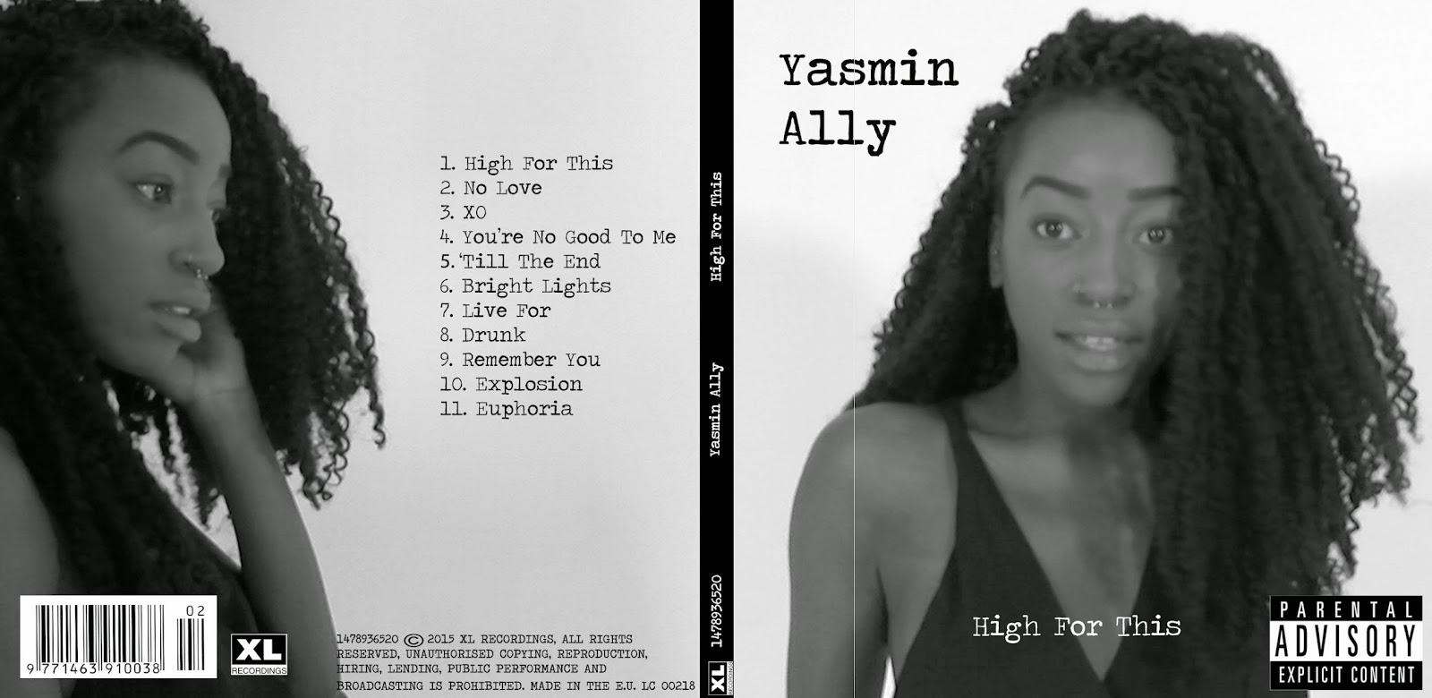
In order to construct my ancillary products photoshop was needed to create the digipak and advertisement for the digipak.


  •  Final Cut Pro 
The editing for the music video was done on the programme Final Cut Pro. From before the filming began we planned on  having some parts of the video in black and white and other parts of the video to have a allow motion effect to give reinforce the euphoria vibe.
The black and white visual was done using the colour picker effect so that everything within the shot appeared in black and white apart from the feature we wanted to stand out with the colour which was the majority of the shots that consisted of the artist (Yasmin Ally) holding the smoke bombs, these shots also included the slow motion effect to slow down the speed of the smoke coming out the tube.

Tuesday, 20 January 2015

[EVALUATION] Question 1

Evaluation Question 1: In what ways does your media product use, develop or challenge forms and conventions of real media products?


Wednesday, 14 January 2015

[PRODUCTION] Editing photos on iPhone app 'VSCO'

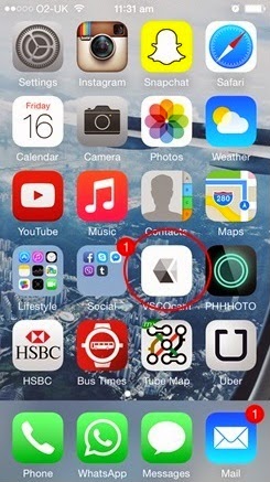
As part of my experimental research I also decided to try and edit my photos on a iPhone app, VSCO. This app is a app that I personally use to edit my own images, which is why i chose to use it. The app allows you to edit your desired photos, so you can with change the exposure, temperature and contrast there is also is other features such a cropping tool as well as a sharpening tool. What I really liked about the app was that it has a series of filters that you can apply to your photo, I thought that the filters provided all had nice effects and when I was testing it out on my own photos I felt as though it worked really well. 

I experimented in different ways, trying out every editing feature that was provided by the app. I changed the image to a black and white style and then also did a colour version. I felt as though the original photos all had a funny lighting which is why I had to mess about with the exposure and temperature. As you can see from the screenshots these are the different types of edit I have done. I also edited the image that I have changed from photoshop as well. 


Tuesday, 13 January 2015

[PRODUCTION] EXPERIMENTING ON PHOTOSHOP

I spent a lot of time on photoshop trying to figure out how I want my digipack and advert to be, because of the screen grabs I knew I had to experiment with the pictures to make them as good as possible.

For the edit of my photos I have decided to do a multiple exposure type of theme. Double exposure is being able to apply either two or more either same or different kind of photos. In my case I have duplicated the same image into separate layers, changed the opacity for each layer and then mover about 3 cm of each layer to the left. This created a almost 3D kind of effect to the photo overall. I have also tried to do a invert style where one of the layers in particular is inverted making the image have a slight illumination outline. I felt that it fit well with album because the album was mean to portray a euphoria type of feel. I have also began to try out different style of fonts along with the picture to get a sense of what it could look like. As you can see from the screengrab this has slightly grey background to it and so I would have to get rid of it and make it why to keep the synergy between the music video and the digipack continuous. 


[REFLECTION] NOT BEING ABLE TO TAKE NEW PHOTOS

Sadly our plans to shoot some extra pictures for our digipak couldn't continue because after returning back to class after the christmas break, we found out that Nicole was, in a accident which was the reason why when we tried to contact her she'd never reply back. It was only when she came back to lesson which was when we knew of her situation, as we were already running out of time and we want to didn't push Nicole since she wasn't in a good state.
Luckily we took some picture beforehand when we went filming. But even though we already some photos already, when we went over to review them they weren't in good quality also there wasn't range of shots that we could all choose from this then meant that we has to screen grab pictures from our music video. We knew that this was also not the best thing to do but we felt that if the screen grabs were strong enough we could somehow transform it on photoshop. 


[ANCILLARY PRODUCTION] - Digipak Production 2

Digipak Production 2 

So I finished most of the digipak exterior before I realised that to get the same colour of smoke and same areas of isolation I would need use the exact same image. GREAT Nahida why don't you just come up with this after you have already edited the picture onto the digipak template. So I figured I had to edit the picture separately, but this was a great chance to screenshot my progress.

I also decided to brighten the blue as it was looking a little to dull and did not achieve this burst of colour/ euphoric feel that I was attempting to portray.

Colour separation in Photoshop Elements:
1. Convert the image to black & white
2. Using the Magic Wand tool select which parts of the image to isolate in colour.

3. Then click, Enhance, Adjust Colour & Colour Variations on the menu bar at the top.

4. Play around with the colour variations until you find what you want. Increase/Decrease colour hints of red, green, blue. Lighten/Darken the colour.

[ANCILLARY PRODUCTION] - Advert Production

Advert Production

*created using canva*

Working on the digipak exterior and giving it my all got slightly tedious after a while and also I was stuck on what else to add and so I thought I might as well have a head start on the advert while I could. 

My initial idea for the advert was to be similar to the Weeknd's tour date advert.


However after I got started I didn't like it, I wasn't feeling it. I thought it was not expressing my abilities in the way it should.

I decided to change my layout and resort back to photoshop so I was not so limited in the editing aspect.

changes to the layout:
- Instead of a black background, use the main image from the digipak as the background
- ditch the image of the album cover on the advert *as it'll be too many lines and too heavy on the eye*

Monday, 12 January 2015

[RESEARCH] ANALYSING OTHER ARTIST'S WORK

[ANCILLARY RESEARCH] - Extra Digipak Research

Extra Digipak Research

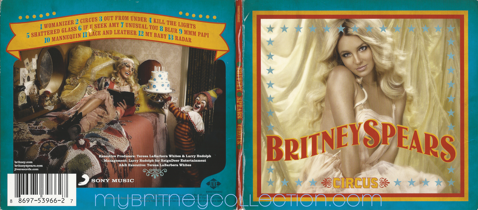
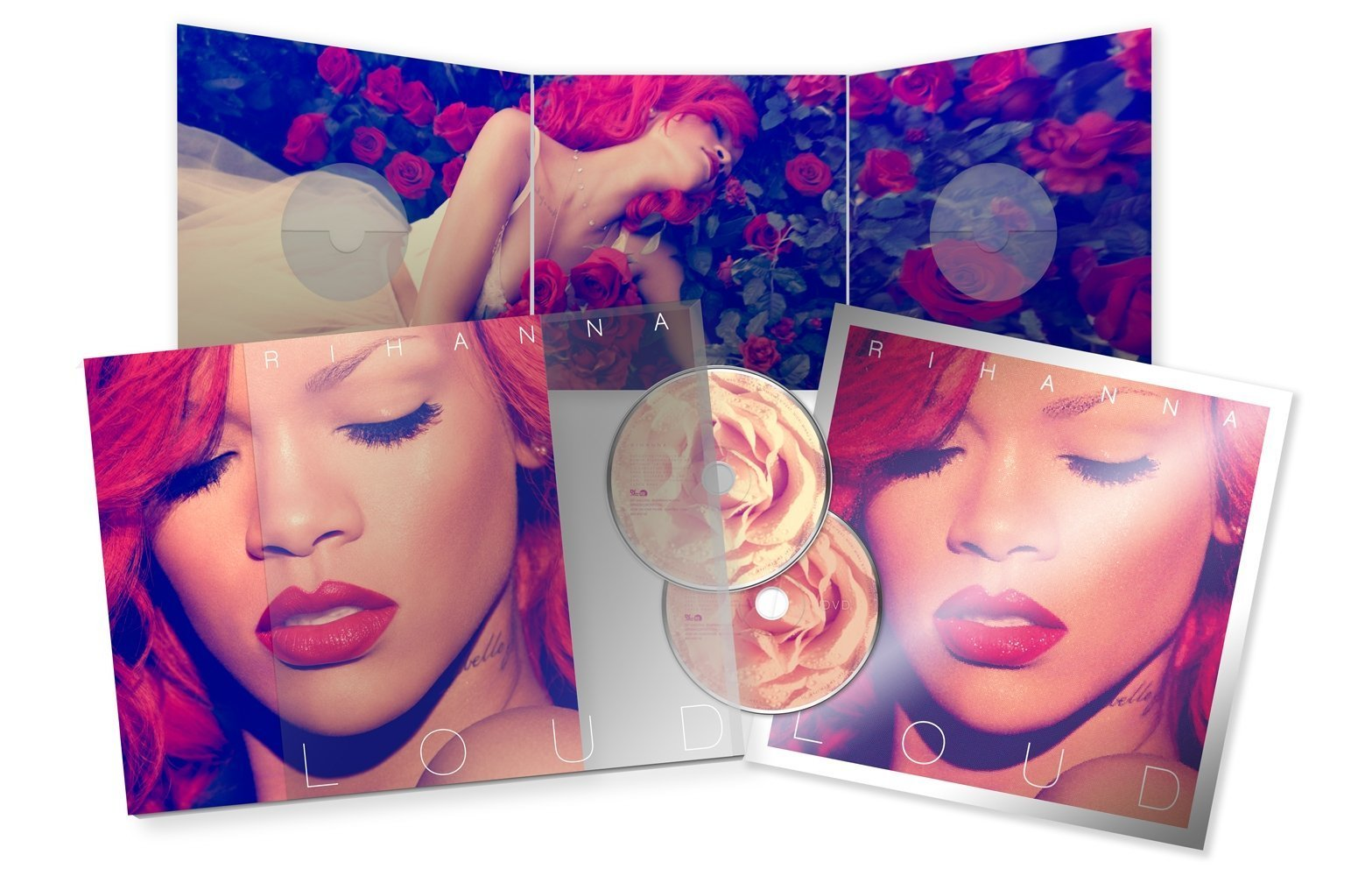
While working on my outer cover of the digipak, I looked through other digipaks with Chenny for more inspirations and ways to justify my ideas, such as my use for a long shot instead of a close up like majority digipaks. 

Firstly we looked at random digipaks on google and they showed most of the covers to use close ups so at this moment I can't lie I was panicking as I did not want to go out on a Photoshoot getting more pictures and I was unsure of the groups availability. Also I really like the image I have originally chosen. Here's our first set of findings...

Next we had a look at debut album covers, which didn't really give me any hope either. Again the same theme of close ups were repeated. Until I saw Frank Ocean - Channel Ocean. I was like Thank the lord. Frank Ocean is a PBRnB artist and his cover has no imagery. This debut album of his was quite successful and added to the simplicity theme of the genre that I also want to portray. 

I now feel more confident as to how I want our artist to be portrayed through her digipak. 


[PRODUCTION] HOW I HAVE PLANNED MY DIGIPACK

Here is a written plan of my digipack, it includes how I want it but also an alternative if my initial doesn't work out. It explains the exactly how I want it from, the font style, font colour, layout, and the actual picture.

Sunday, 11 January 2015

[RESEARCH] INTRODUCTION TO ACILLIARY WORK

Now that we have completed our music video assignment, the next part of the project is to create a digipak and magazine advertisement as part of the promotion for our artist. A digipak is essentially consist of a  CD cover, the actual CD itself and magazine advertisement of the CD. This time round our course work is based individually all on our own, even though we'll still be in our group all of our work that will be done has to based on our own efforts and ideas on how we want our digipack to be like. 

While in class we discussed the basic requirements that are need when creating our digipak and advert. For example a digipak can have different types of templates that you can choose from, 3 panel or 2 panel. Also when creating the digipack we have to follow a certain type of theme so that it fits into our particular genre type but importantly the artist. A good thing that you could look for is creating synergy between your music video and the digipak. In our music video we have used a white studio as our main basetrack so we could follow theme onto the digipak and shoot pictures in the same style. We also use smoke grenades, which gave of a very beautiful effect, so again we could also cooperate that into the digipak.

As well as making sure the visuals are all on perfect, we have to keep in mind of the minor details which help make the digipak and advert come together. For instant the digipak will require a colour scheme and font style theme. The colour scheme has to be no more than three colours and must consistently used through the digipak and advertisement, once you choose the colours you want to use them you must stick to those choices. This why you must choose colours that will go well with your overall theme. Again for the font style there is no more than two font style choice that you can have. You can choose what ever font you like but it has to work well with your theme. The fonts will not only help represent your artist but allow the audience to recognise your artist so it's important to chose the right style. 
The minor details that you should look our for are, on a digipack there is a very thin spine that has your artist name, their album name and a code. This code is used through all digipaks and so you must ensure that you have one. Don't forget you add a barcode, copyrights logo, the record label, and a album stick. 


Friday, 9 January 2015

[ANCILLARY PLANNING] - Ancillary Productions Pitch Feedback

Ancillary Productions Pitch Feedback

After pitching my ideas to Louisa, I was suggested changes that I should consider in order to maximize my abilities to produce a high standard piece of work.

Overall she explained how I had a strong piece, but there were little bits and bobs that I should probably change.

Firstly she suggested I use a different image for the main digipak, as a long shot was really winning her over and also there was a lamp post that was taking away the attention from the artist.
However I was able to justify my reasons for using this specific picture which it that: 'most PBRnB artists such as Jhene Aiko, The Weeknd, Frank Ocean, Miguel tend to have album covers with attention diverted away from them, and so I was only trying to portray the conventions of the genre which we focused on'. Also I wanted to use this image as it uses the smoke flare which is also shown in our video which give the synergy link to all 3 products. Lastly I felt as though the way production went with our music video (the disorganization) that I didn't wish to get together with the group and go out and take pictures so tried the best with what I already had.

She also suggested that I remember to add the production information.

Looking at my mock ups of the digipak it was clear that there was no link between the inside and outside which means I wasn't following the 'appropriate digipak rules' and so she suggested that a image to be used to connect the two, perhaps another smoke shot with 'Yasmin Ally' travelling the opposite way to the front. 


[REFLECTION] - The End Is Near

Blogging Health Check 3: The End Is Near 


Reading this progress review on my work is rather disappointing but pretty much accurate. I know that my blogging has dropped immensely on the ancillary products work. But nevertheless I have caught up with my blogging and am no longer behind. 

I can sit here a list a whole bunch of unnecessary reasons as to why I fell behind in the first place but the honest truth is that I have not as a whole been motivated to work this year in media and that has resulted in me becoming lazy. Also the fact that I like to perfect my work is another reason why it either takes me forever to get something done or why I can easily lose interest quite quickly. 

The end is near and I've just been getting lazier and well at this moment now I cannot wait until it's all over. But until then, time to get my act together and work at the high standard that I normally would and find some way to get motivated *maybe the deadline should be my motivation*. So here's to the near end... 

[ANCILLARY PRODUCTION] - Digipak Production 1

Digipak Production 1

So the Music Video is now out of the way but nope it's not time to rest but to add to the stress (WAHEY)... After pitching my ideas to Louisa and getting feedback from her as to what I can do to expand my ideas further I opened up Photoshop and stared at the screen for a good few minutes. After mentally putting together my ideas I loosely placed where I wanted the images and text, and the little barcode and record label details. 


Louisa had a little look at what I already had, and at this moment I came across my first dilemma. The was a lamp post bang in the middle of the front of the digipak. This was diverting all the attention away from the artist. As the image wasn't large enough to move along and stretching it would look unflattering, I spent a good 10-20mins just looking at the screen thinking of what I could do. After about 20mins when I realised I was probably wasting time, I decided to add the track listing and all the other little bits and bobs onto the digipak. And then it hit me. I attempted to layer the same image on top however my main focus was on the right side of the brick wall which I cropped and layered on top of the lamp post.

And then came along dilemma 2. 

The colour of the wall was gradient so it was different when I cropped it to cover the lamp post, there were harsh lines and it was difficult to match the bricks, pavement and road together. It was all a game of little shifts here and there until I was able to match it to the best of my ability. I then attempted to use the blur tool to blur the harsh line between the 2 layers. However this made it look even more obvious and unprofessional. 

After more staring at the screen and thinking blankly into space. I finally came up with cutting out aspects of the road with the magic wand tool. Then using the eraser with a blurred edge I attempted to rub and blend the harsh line until I successfully achieved the look I was going for. 

Just then when I start thinking 'Yes Nahida You are on a roll,' I look at the image and realise the whole image is black and white and the isolation of colour that I wanted to add I still had to figure out how to do. So after more staring at the screen I decided to just explore photoshop, theres no harm in that is there. 

I tried the layering technique again but that was on no success. After ripping at my hair and more staring at the screen I remembered the Magic Wand tool. Once again saving my life I chose which parts I wanted in colour and then went to enhance the colour and increase the blue in that section of the image and it worked. I felt so proud of myself, reaching outside my comfort zone and expanding the technological abilities. 


I was thinking maybe to expand the smoke motif a bit more but for now I am happy with what I have and I think it is ready for some audience feeback. Until then, I shall begin work on the inside panels and the advertisement.

Tuesday, 23 December 2014

Thursday, 18 December 2014

[REFLECTION] - Cinema Viewing of Music Video

Cinema Viewing of Music Video


Today, the media students all had the opportunity to watch all our music videos on a big screen at a cinema near by our college. It was great to watch other student's music videos and a photo montage of all our hard work put into them. The work produced was absolutely phenomenal and I was proud of myself and those in my year group. We also had the opportunity to gather some feedback which could come in handy for the evaluation process. 

Unfortunately the footage I gathered of the feedback wasn't great so I plan to get more for evaluation at the latter.

Here's a video of the LIVE reaction to our Music Video and also a few feedback notes. The reaction was amazing and uplifting. *Unfortunately you can't feel the outstanding atmosphere through the video*


Tuesday, 16 December 2014

[PRODUCTION & PLANNING] Being spontanous

From the first day of filming, we were very spontaneous about our decisions that we made. Even though we create a storyboard, we honestly didn't follow the story board. We only followed our story board on the first and second day of filming. The decisions we made were based on how we felt about the current footage he have so far and how what can we do now that would be efficient and easily accessible. So in this case there were times when for example on the second day of filming, we passed the thames, but on that day we didn't plan to film there but because of the good view and great weather, we all felt that we should film some shots of the location.

For a lot of video there we're a lot of things that we didn't plan but I guess it made our music video better because, at the beginning of the filming stages I personally didn't have a proper vision on how I wanted the music video to be but as we began filming more and more, I began to see how I wanted things to work and so whenever I felt something could be fit into the video I then thought we should try and incorporate it in.

Sunday, 14 December 2014

Changed The Background!

Our old background was the default blue skies and clouds which wasn't exactly visually appealing nor relevant to our project as a group. So I thought to switch it up, using the cover art for Ellie Goulding's song High For This  as our new background (found it on google) which is indeed our chosen song and basically what we've been working with as a stimulus for the past few months. The greyscale of the cover art looks quite similar to some shots from our video aswell!  

Saturday, 13 December 2014

[ANCILLARY RESEARCH + PLANNING] - My Ideas

My Ideas

So with the Music Video out the way, it is time to work on the Ancillary Products. We have the task to create 3 Ancillary Products - The Exterior and Interior of a digipak and a magazine advert to accompany it. So coming up with a digipak and advert is not the easiest thing in the world, in fact it is rather difficult, especially for a perfectionist like me. I have no clue as to what pictures I may want to use of what fonts will be best and so more research and shortlisting is needed. I know what feel I want to get from these ancillary product so I guess thats better than nothing. It's all a matter of knowing what you want and what you don't want and I am on my way getting there but it looks like I need to get inspiration and speed this process up. This is actually rather unusual, as I am a creative person and I can usually imagine what I want my final piece of work to look like but right now I am blank, with maybe a few specks of dust here and there. 

My first few thoughts when planning the digipak and advert. 
The Music Video has very simplistic theme to it, with the simple clothing and setting and this is what I hope to portray in the digipak and advert to ensure there is synergy through all the products. I also want to carry over the black and white theme with a hint of colour and so this led to me to want to use one of the smoke shots so I could use this repetitive colour separation edit which also has synergy elements with the Music Video.  Now down to researching, and shortlisting, Images & Fonts. 

Colours


Fonts

My initial idea for fonts is to use the maximum 2 instead of 1 as I want to make the artist name stand out as we are attempting to promote a new artist. For the artist name I want to use a signature, handwritten like font to give it a more personal and engaging feel to it, much like Jhene Aiko's debut album. I also like how she used a more standard, bold font and would also like to take inspiration from this idea. 

In order to find fonts that I could use I carried out some research on Font Book and DaFont to find 2 suitable fonts and shortlist them. 

Firstly these are the fonts I found on Font Book, which I think could be used. 
*annotated to show which ones I probably should cut as they don't exactly fit my own specifications*


Although I found some fonts I liked I didn't feel that they were as strong for the advert and digipak as would have wanted them to be. I then moved on to look for more fonts on DaFont.com. While browsing the website I came across some graffiti fonts which I could consider using to achieve the urban aspect of the digipak and advert. 


However I felt this could corrupt the simplistic theme I was hoping to achieve, so decided to scrap that idea. Besides they don't exactly look like they'll be easy on the eye.


Between both Font Book and DaFont I have narrowed down my fonts to the following...
Now it all depends on what suits the final digipak and advert and compliments it as a whole.

Pictures

*Made using Picasa*

Digipak Layout


Advert Design

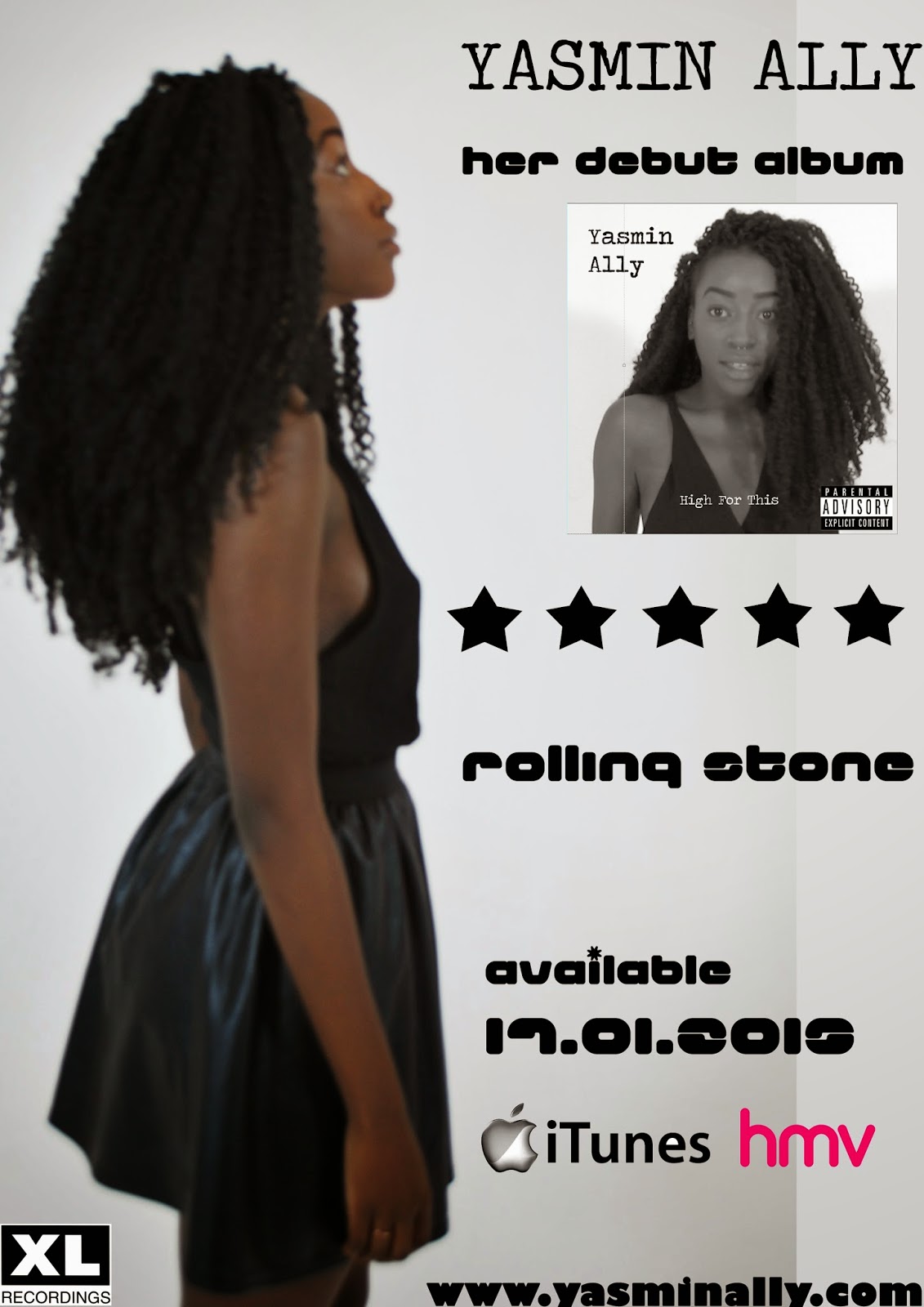
Most of my inspiration for an advert was from The Weeknd, who is a PBRnB artist and so the simplicity of the Ad gave me ideas as to how I would approach creating my own.

However there were ideas of my own which I also implemented. This was just the base from a layout. Instead of making it an Ad with concert information I wanted to focus more on album release details as a way of promoting and branding our artist. The simple album cover, Artist name and album title at the top and, release details at the bottom. SIMPLE.


Now that I have complied my ideas together, I can now start working on my digipak and playing around with Photoshop elements until I achieve what I hope to. I hope I can closely follow the ideas I have whipped up together, but in the case that I cannot then I'm sure it would be at a high standard and just as effective. Here we go...

Friday, 12 December 2014

[ANCILLARY PLANNING] - Overview on Do's & Don'ts

Overview on 'Do's & Don'ts'


[ANCILLARY RESEARCH] - Digipak Design Activity

Digipak Design Activity

We were set the task to design a digipak using images given to us. 


If there's one thing I learnt from this lesson it would be SAVE along the way or screenshot my progress. 

Analysing Real Media Ancillary Texts


[ANCILLARY RESEARCH] - Analysis of Digipaks & Advertisements

 Analysis of Digipaks & Advertisements


Jhene Aiko - Sail  Out (Debut Album)

Unfortunately I could not find an advert for this album, but I would also imagine it to have the same imagery, the peace like logo and the same fonts.

The Weeknd - Trilogy


Ellie Goulding - Bright Lights


Monday, 8 December 2014

[REFLECTION] - Blogging Health Check 2

Blogging Health Check 2 


Reading this note on how my progress is going has been very satisfying and mood lifting. Knowing that I am now working at a grade more suited to my skills makes me very proud. But again I am confident that I can exceed this grade and do much much more. However I am still not motivated in this whole project. I feel that I have not had any fun in creating the music video and that all I have been in stressed and cannot wait for it to be over.

I have successfully taken on board the notes that Mary has given me and have worked accordingly. I have attempted to use a range of ICT technologies to make these blog posts much more enjoyable. I caught up on all the blogs that I was missing as fast as I could and have tried my best to put in as much detail as possible.

However I still feel as though I have gotten slightly behind on progress blog posts about how editing has been going as up until this Blogging Healthcheck Mary has found some gaps so I think a target here is to do the blog posts as soon as possible and not delay with my laziness. 

I have also worked towards my own targets such as that of getting organised and have also recorded how I have organised myself using lists and iPhone Apps. 

So from here on I will:
  • Keep a high standard of detail in my Blog posts
  • Keep up to date with my posts
  • Carry on using different ICT technologies and possible add a post on the strengths and weakness of these applications/softwares as well as a post on research used to find these.
  • Stay organised. 

Friday, 5 December 2014

[PRODUCTION] - Editing

Last Few days of Editing

created using keynote

[PRODUCTION] - Skills Development

Skills Development

One of the new skills I taught myself was the colour separation on the smoke in the clips we used. Here's a video which outlines the steps I took. 

  1. Select the clip you want to work with 
  2. Go to effects, video filters then Colour Correction, the Colour Corrector 3-Way
  3. Then on the video, clip on the colour corrector 3-way Tab
  4. At the bottom clip the drop down arrow on Limit effect
  5.  Using the Eye Dropper, select the colour in the video which you want to separate i.e the colour of the smoke
  6. Invert the selection and take the saturation down. 
  7. Untick Sat and Luma
  8. Then slide the limit effect colour bar slightly until you have the clip how you want it. 

New Location/Failed Filming Session

[PLANNING] On the hunt for a black studio

On the Hunt for a Black Studio 

After our last lesson on Friday, we submitted our rough cut and received feedback from Louisa. During that lesson me and Nicole went and did more filming for the music video as we needed to shoot some more shot. We initially wanted to find a black room as when we planned the music video we wanted to be in contrast with our white studio room that we had already filmed in. We used a class room in the college which has black curtains, we thought that it would be okay and would work with the footage we already got, but when we when reviewed the footage we could all see that the quality standard was not compared to what we filmed in the white studio. The lighting in classroom was far too yellow and grainy So we took into consideration to try find a black studio, even though it wasn't decided for definite whether we would need a black studio or not because our rough cut wasn't completed at the time. 

So as I took the responsibility to book the white studio room in Bethnal Green, I also took charge and said that I would try and to find a black studio. I again contacted Studio Space again, as they were the only studio I knew at that time which had a black studio. 


I received a reply, so now we just need to review the rough cut again, which can't determine whether we are going to re film or not. 

Costume @ The Studio!


Final Stages!

Monday, 1 December 2014

[PRODUCTION] - Rough Cut Feedback

Rough Cut Feedback


Chenny and I (Nahida) were very stressed with what we had and were not happy with it. We felt as though we needed to reshoot some shots to make them stronger and pull the whole video together. However after the rough cut feedback we feel a little bit less stressed with it all. I think the comments were pretty good and the feedback we could definitely work on. 

Response to Feedback:

  • There was a red tint on one clip however that was us experimenting on how we can fix our problem with the out of focus shots. The audience liked this, but we are still unsure on whether we want to add it in as it didn't really help with our out of focus shots. *If we do decide to use it, to make it more often.*
  • Strengthen our chorus - so we could have the outside shots with the each smoke shot. 
  • Change one of the sofa shots as the leg acts as a barrier
  • Change some of the shots at the beginning to work around the focus shots - We've watched through all the footage with Louisa and identified which ones were out of focus and which ones we could use.
  • Use the lamppost shots in reverse as well.
  • Change the hair flick shot - either slow mo it to fit or have it on a beat
  • One of the last Woaah oohh Shots out of sync so fix it up. 
So much to do but I think we can pull it off. 

Evaluation Question 1 [Notes]

In what ways does your media product use, develop or challenge forms and conventions of real media products?

Andrew Goodwin
- Amplification of lyrics; giving visual meaning to the word 'high'
- Yasmin breaks 4th wall
- Seductive behaviour portrays sexual behaviour described in the lyrics of the song 
- Similarities with the work of FKA Twigs and The Weeknd who's music is of the same genre as Yasmin's

Laura Mulvey
- Male Gaze: Revealing clothing, seductive body language, singing to a male counterpart 'trust me boy, you'll wanna get high for this'
- Similar to Beyonce's single ladies 
- Vulnerability portrayed through body language making the boy Yasmin is singing about/to immediately superior 

Carol Vernallis
- Colour separation; coloured smoke and black and white background (editing): similar to Chris Brown's 'Don't think they know' video