My Ideas
So with the Music Video out the way, it is time to work on the Ancillary Products. We have the task to create 3 Ancillary Products - The Exterior and Interior of a digipak and a magazine advert to accompany it. So coming up with a digipak and advert is not the easiest thing in the world, in fact it is rather difficult, especially for a perfectionist like me. I have no clue as to what pictures I may want to use of what fonts will be best and so more research and shortlisting is needed. I know what feel I want to get from these ancillary product so I guess thats better than nothing. It's all a matter of knowing what you want and what you don't want and I am on my way getting there but it looks like I need to get inspiration and speed this process up. This is actually rather unusual, as I am a creative person and I can usually imagine what I want my final piece of work to look like but right now I am blank, with maybe a few specks of dust here and there.
My first few thoughts when planning the digipak and advert.
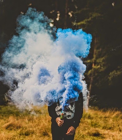
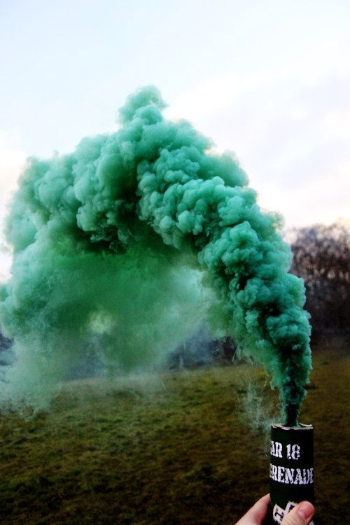
The Music Video has very simplistic theme to it, with the simple clothing and setting and this is what I hope to portray in the digipak and advert to ensure there is synergy through all the products. I also want to carry over the black and white theme with a hint of colour and so this led to me to want to use one of the smoke shots so I could use this repetitive colour separation edit which also has synergy elements with the Music Video. Now down to researching, and shortlisting, Images & Fonts.
Colours
Fonts
My initial idea for fonts is to use the maximum 2 instead of 1 as I want to make the artist name stand out as we are attempting to promote a new artist. For the artist name I want to use a signature, handwritten like font to give it a more personal and engaging feel to it, much like Jhene Aiko's debut album. I also like how she used a more standard, bold font and would also like to take inspiration from this idea.
In order to find fonts that I could use I carried out some research on Font Book and DaFont to find 2 suitable fonts and shortlist them.
Firstly these are the fonts I found on Font Book, which I think could be used.
*annotated to show which ones I probably should cut as they don't exactly fit my own specifications*
Although I found some fonts I liked I didn't feel that they were as strong for the advert and digipak as would have wanted them to be. I then moved on to look for more fonts on DaFont.com. While browsing the website I came across some graffiti fonts which I could consider using to achieve the urban aspect of the digipak and advert.
However I felt this could corrupt the simplistic theme I was hoping to achieve, so decided to scrap that idea. Besides they don't exactly look like they'll be easy on the eye.
Between both Font Book and DaFont I have narrowed down my fonts to the following...
Now it all depends on what suits the final digipak and advert and compliments it as a whole.
Pictures
*Made using Picasa*
Digipak Layout
Advert Design
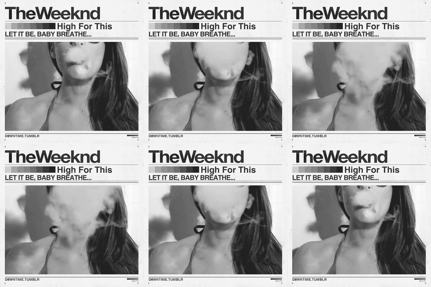
Most of my inspiration for an advert was from The Weeknd, who is a PBRnB artist and so the simplicity of the Ad gave me ideas as to how I would approach creating my own.
However there were ideas of my own which I also implemented. This was just the base from a layout. Instead of making it an Ad with concert information I wanted to focus more on album release details as a way of promoting and branding our artist. The simple album cover, Artist name and album title at the top and, release details at the bottom. SIMPLE.
Now that I have complied my ideas together, I can now start working on my digipak and playing around with Photoshop elements until I achieve what I hope to. I hope I can closely follow the ideas I have whipped up together, but in the case that I cannot then I'm sure it would be at a high standard and just as effective. Here we go...
 After much reluctance in the beginning stages of the project, I have now become accustomed to playing our artist: Yasmin Ally!
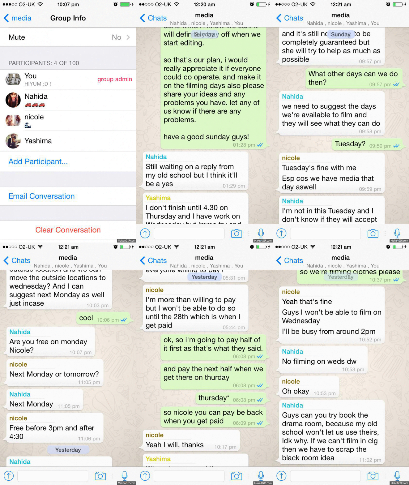 The gif here shows that I have tried to communicate with the entire group, I have left a long and details message to all of them which explains clearly what what is the plan for our next filming session (thursday 20th). I've made sure to keep everyone updated of times locations and ideas have come up while we haven't seen each other, I've also asked for everyone's best effort and hard work to be put into each meetup we have, as I know that it can be hard and tiresome especially for Nicole as she's the one performing, so I have asked for everyone bare with the the long hours and try to put 100% effort.
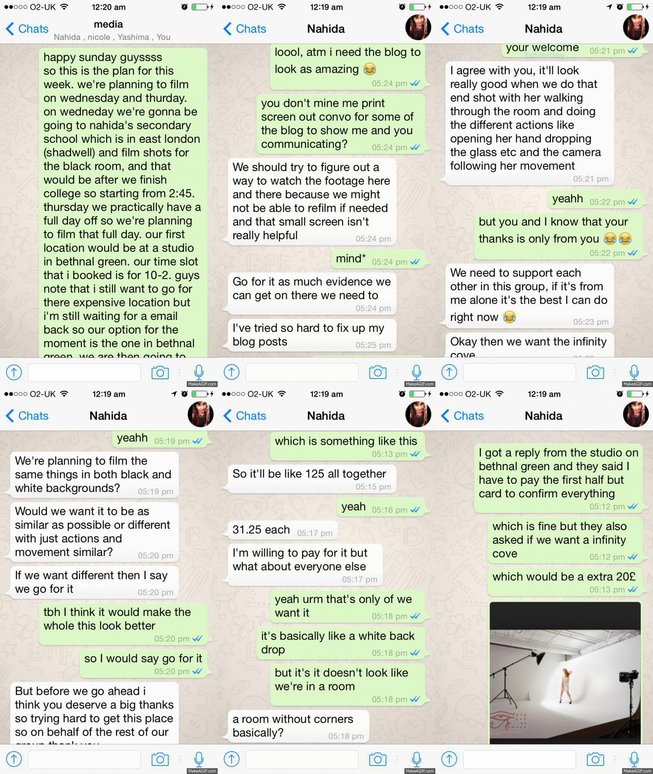 I and Nahida in particular have been speaking to each other regularly and separately, this is because I feel that she and I are seeing the project at a more serious level and so because of this I feel as though if have any problems I am able ask her for a opinions and advice. We usually sort out the schedule together and check before hand with each other first when we have a suggestion to put forward to the team.